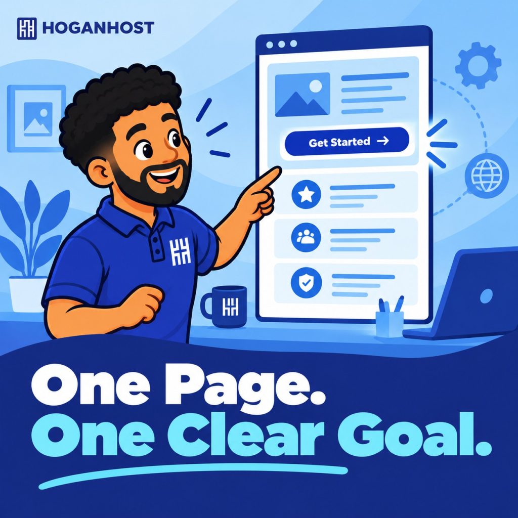
You offer two or three services, you have a phone number people can call, and you want to be online by next week. Do you really need a ten-page website for that?
For many small businesses, a single well-built page does the job. The catch is that a one-page site has only one chance to get things right.
When a One Page Website Makes Sense
A one-page design fits best when your business is simple, and your goal is clear.
- You offer a small number of products or services.
- Your main goal is calls, messages, or form enquiries.
- You are launching quickly and want something live now.
- You are a freelancer, tradesperson, or local service provider showing off your work.
If you have many service categories, lots of products, or plan to publish regular blog content, a multi-page site will serve you better.
The Honest Downsides
One-page sites are not perfect for everyone.
- Limited search visibility. With one page, it is harder to rank for several different topics at once.
- Crowded content. Trying to fit everything on one page can overwhelm visitors.
- Harder to grow. Adding new services, a blog, or an online store later usually means rebuilding.
- Less to share. Visitors cannot link to a specific service page.
Know these limits before you commit, so the choice is deliberate.
The Sections Every One Page Site Needs
Think of the page as a short conversation with your visitor, from top to bottom.
- A clear headline. Say what you do and who it is for, in one sentence.
- A call to action. A visible button such as “Call now” or “Request a quote” right at the top.
- Your services or offer. Short descriptions, ideally in cards or bullet points that are easy to scan.
- Proof. A few honest customer reviews, photos of your work, or logos of clients.
- About you. A brief paragraph and photo so visitors know a real person is behind the business.
- A contact section. Phone number, WhatsApp link, location, and a simple form.
- A short FAQ. Answer the questions customers keep asking so you do not have to repeat them.
Navigation Matters More Than You Think
On a single page, the menu does the work of a whole site.
- Use a menu that scrolls smoothly to each section.
- Keep the menu visible as people scroll, or add a clear “back to top” option.
- Repeat your main call to action at least two or three times down the page.
Design for the Phone First
Most Nigerian visitors will see your page on a mobile phone. A one-page site makes this easy to test, because there is only one layout to check.
- Make buttons large enough to tap with a thumb.
- Keep text readable without zooming.
- Compress images so the page loads quickly on mobile data.
Keep It Fast
A single page packed with large images and heavy animation can load slowly, which defeats the purpose. Use compressed images, limit the number of fonts, and skip effects that add weight without helping the visitor.
Plan Your Next Step Early
A one-page site is a smart starting point, not a final destination. If your business grows, you can expand into a multi-page site while keeping the same domain and branding.
If you would like a one-page site designed properly from the start, HoganHost’s web design team can build a clean, mobile-friendly page that turns visitors into enquiries.