
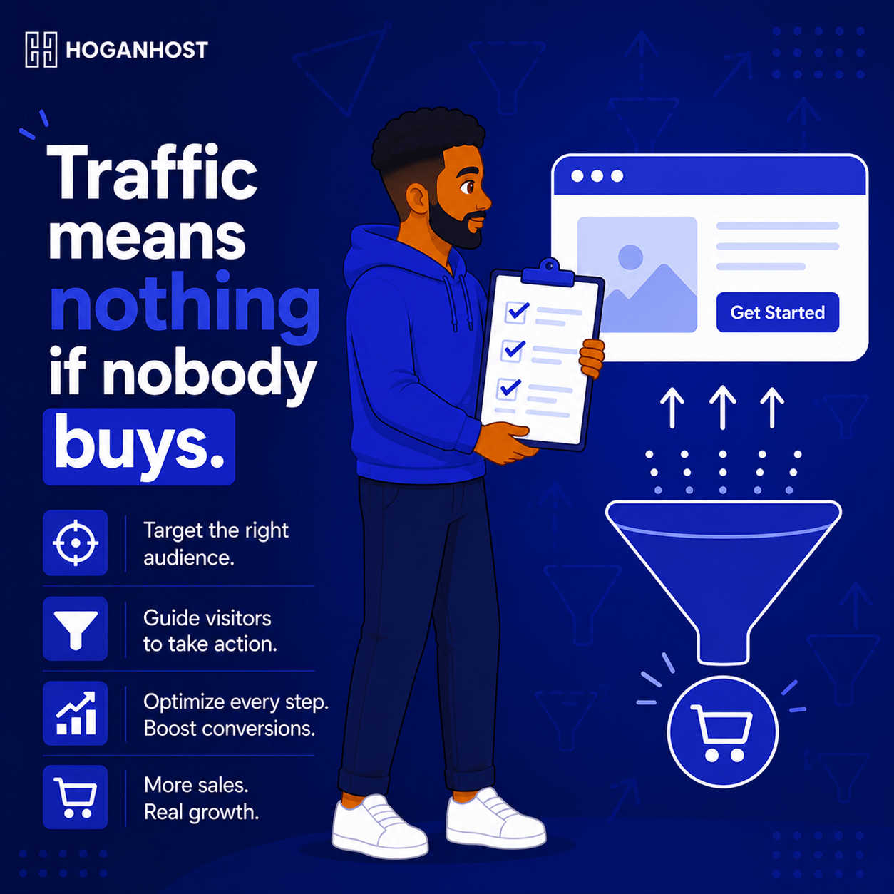
Getting visitors to your website is only half the job. If they land, look around, and leave without taking any action, all that traffic effort was wasted. Here is everything you need to know about designing a website that actually turns visitors into paying customers.
Step 1: Give Every Page A Single, Clear Purpose
A page trying to do everything at once usually convinces visitors to do nothing. Before designing any page, decide the one primary action you want a visitor to take there, whether that is making a purchase, filling out a contact form, or booking a call.
Every element on that page- your headline, your images, your layout- should support that single action rather than competing with several unrelated goals at once.
Step 2: Make Your Value Immediately Obvious
Visitors decide within seconds whether to stay or leave. Your homepage and key landing pages need to answer three questions immediately, without requiring any scrolling or searching:
- What do you actually offer?
- Who is it for?
- Why should they choose you specifically?
A vague, clever headline that requires interpretation loses visitors who simply move on rather than working to understand your message.
Step 3: Design A Clear, Obvious Call To Action
Every page that matters for conversion needs one clear, visually distinct button or link telling the visitor exactly what to do next. Avoid vague labels like “Submit” or “Click Here.” Use specific, action-driven text like “Get Your Free Quote” or “Start Shopping Now,” which tells visitors precisely what happens when they click.
Keep this call to action visible without excessive scrolling, and repeat it at logical points further down longer pages, rather than placing it only once at the very top.
Step 4: Build Trust Before Asking For The Sale
Visitors rarely convert on a website that feels unfamiliar or unproven. Layer in trust signals throughout your design:
- Genuine customer testimonials or reviews, ideally with names and specific details rather than vague, generic praise
- Clear, real contact information, including a professional business email address on your own domain
- Security indicators, like a visible SSL padlock, particularly important on any page collecting payment or personal information
- Recognizable payment method logos on checkout pages, since unfamiliar or unclear payment options create hesitation at the final step
Step 5: Remove Every Unnecessary Point Of Friction
Every extra step, every unclear instruction, and every unnecessary form field gives a visitor another chance to abandon the process. Review your conversion path, whether that is a purchase flow or a contact form, and remove anything that is not genuinely essential.
- Keep forms as short as possible, asking only for information you truly need at this stage.
- Avoid forcing account creation before allowing a purchase, if a guest checkout option is feasible.
- Make navigation simple and predictable, so visitors never feel lost trying to find what they came for
Step 6: Design For Speed, Not Just Appearance
A beautiful website that loads slowly still loses conversions, since the data consistently shows that even a single additional second of load time measurably reduces conversion rates. Prioritize a clean, fast-loading design over one loaded with heavy animations and effects that add little real value beyond visual flair.
Step 7: Design Mobile-First, Not As An Afterthought
Since most visitors now browse primarily on mobile devices, design your conversion path for a phone screen first, then adapt it upward for desktop, rather than the reverse. Test your actual checkout, contact form, or booking flow on a real phone before assuming it works well simply because the desktop version looks polished.
Step 8: Test And Refine Based On Real Behavior
No design is perfect on the first attempt. Use analytics to see where visitors are actually dropping off in your conversion path, and use that real data to guide specific improvements, rather than redesigning based on assumptions alone.
- Watch which pages have unusually high exit rates.
- Track how far visitors get through a multi-step checkout or form before abandoning.
- Test small, specific changes, like button wording or form length, and measure the actual impact before rolling changes out further.
Common Mistakes That Kill Conversions
- Cluttering a page with too many competing calls to action, leaving visitors unsure what to actually do.
- Hiding pricing or contact information, forcing visitors to hunt for basic details that should be immediately visible.
- Ignoring mobile users, when they likely represent the majority of your actual traffic.
- Adding unnecessary form fields, creating friction that causes visitors to abandon partway through.
A website that converts is not necessarily the most visually elaborate one. It is the one that removes confusion, builds trust quickly, and makes the next step obvious at every point in the visitor’s journey.
Ready to build a website designed to actually convert your visitors into customers? Get expert web design support from HoganHost and stop losing sales to a confusing or slow website.