Before a visitor reads a single word on your homepage, they’ve already formed an opinion. Most of that snap judgment comes from color alone, often within seconds of the page loading.
That’s a lot of pressure riding on a palette most business owners pick without much thought. Let’s fix that.
Color Is Doing More Work Than You Think
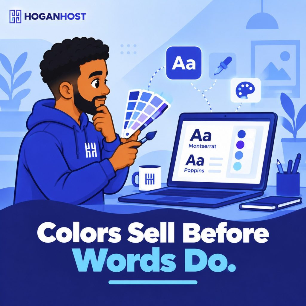
Studies on buying behavior consistently show that color plays a huge role in whether people trust a brand and follow through on a purchase. It also shapes how memorable your website is. A consistent, well-chosen color scheme makes people recognize your brand faster the next time they see it.
That’s not decoration. That’s your first sales pitch, delivered before your copy even gets a chance.
What Different Colors Communicate
Colors carry meaning, and that meaning shifts slightly depending on your audience and industry.
- Blue signals trust and stability. It’s the most common color for banks, tech companies, and hosting providers for a reason.
- Green suggests growth, health, or “go ahead, it’s safe.” Common in finance and wellness brands.
- Red creates urgency and grabs attention fast, which is why it shows up so often on “Buy Now” buttons.
- Black and gold tend to read as premium or luxury.
- Orange and yellow feel energetic and approachable, popular with food and youth-focused brands.
Pick colors that match what you actually want a visitor to feel the moment they land on your page.
Contrast Is Not Optional
Here’s the part most small business websites get wrong. Text needs to stand out clearly from its background, and a huge share of websites currently fail basic accessibility contrast standards.
Poor contrast doesn’t just look unpolished. It makes your site harder to read for anyone with low vision or color blindness, and it quietly pushes visitors away before they even realize why.
A quick fix: dark text on a light background, or light text on a dark background, with enough separation that you’re not squinting to read it. If you have to ask “can I actually read this,” so will your visitors.
Choosing Fonts That Match Your Brand
Fonts carry a personality just like colors do.
- A clean sans serif font like Inter, Poppins, or Open Sans reads as modern and approachable, good for most small business sites.
- A serif font like Georgia or Playfair Display reads as more formal or established, useful for law firms, schools, or financial services.
- Avoid decorative or handwriting style fonts for body text. Save them for a logo or a small accent, never for paragraphs people actually need to read.
Stick to two fonts maximum across your whole site. One for headings, one for body text. More than that and your site starts to feel unplanned.
Common Mistakes Nigerian Business Websites Make
- Using too many bright colors at once, which makes the page feel chaotic instead of confident
- Choosing a trendy color combination that has nothing to do with the actual brand or industry
- Copying a competitor’s colors exactly, which kills any chance of standing out
- Ignoring how colors and fonts look on a small mobile screen, where most Nigerian visitors will actually see the site
Bringing It Together
Pick one primary color that matches your brand’s personality, one supporting color for accents and buttons, and a neutral like white, gray, or black for backgrounds and text. Test the combination for contrast before you launch, not after complaints start coming in.
If picking and applying the right palette and typography feels like more than you want to handle alone, HoganHost’s web design team builds websites with color and font choices matched to your brand and your audience from the very first draft.
You can also pair a fresh design with reliable hosting, so the site that finally looks right also loads fast enough for people to see it.